Thursday 4 May 2017
Media Representation
Channel four portrays the children of Britain as highly impressible and extremely naive when it comes to online predators and how it is evident that this view from the dominate ABC1 demographic of BBC.
Firstly, it is clear that young people are highly underrepresented as there are no adolescents presented within the clip. The children of millennium era are depicts as vulnerable and defenceless when its comes to online predators and other cyber issues. The narrative being pushed by channel four is backed by the Hypodermic needle theory which states young people are highly impressible by the information that they are feed online, However this is highly stereotypical and plays on the fears of the paedophilia because this highly unlikely as it is not representative of the experiences and intelligence that 250 million children living in Britain have.
Tuesday 25 April 2017
EVAULTION
My Mest 2 brief is spilt into two parts; broadcasting and print work. The
broadcasting section of the work involves filming and teamwork. Therefore this meant within the coursework, I worked with Pratisha and Nasteha. This also meant that we were extremely dependent on each other and it involved a lot of collective responsibility. However, the print work was completely separate and individual work. The overall theme of our brief has urban, underclass thrill feel to it and this was really showcased within our directorial choices for the brief.
The pre-production was heavily important and valuable as it
helped shaped our ideas for the brief and gave us immense confident in our plan. Films that provided us with excellent insight to be able to formulating our ideas at the time were films such as 'Memento' which has
completely different story-line but has an extremely creative and exploration narrative
structure that we took interest in. Similarly to our film, the movie 'Se7en' followed a similar
narrative structure which includes heavy uses of flashback’s and
plot twists. Lastly, a film recommended by a classmate of ours was 'Strawberry films'
this movie is centred around feminism and female empowerment as our film has all female cast which is quite unconventional. This is noteworthy as the entire cast for this film is female and there tends to a lack of positive representation of women in the film industry and this is due to the fact that the film industry is heavily dominated by men on screen and also off screen. The inspiration comes from a foreign film called Mustang that also centred around femininity and struggles of being a female in the Turkish society which is heavily overlooked in the media. Also, the cast of my film is made up of ethnically diverse women and even the two non biological sisters in the film are from two separate minority groups. This is something i am highly proud as the filmmaker. A lot of these idea plus what worked well in our
preliminary project helped finalise our plan for our production.
The core and dominant target audience are the underclass teens
and young adults from within London aged from 14-24 who would relate and
identify closely with the characters and narrative of the film. Also in terms
of psychographics, they would be classified as strugglers and mainstreamers.
In addition, the secondary target audience would be the abc1 25-45 years old middle class educated people who have a passion for involvement within society and may be intrigued by the concept of the film. The non-primary target audience would be mixture of explorers and reformers in terms of psychographics. However, it is important to take note that these two groups may overlap or intertwine. Also, the last group of audience would be made up of international viewers due to the short film’s urban, social real and arthouse appeal which is a lot more poplar in other countries such as France and Turkey. The wide variety of viewers is a strength due to different appeals and the fact that the movie brings awareness to lack of diversity and incorrect representation of young people and women. However, the numbers of the non-primary audiences may be small such as international viewers as the movie does not cater to them for example language barrier.
In addition, the secondary target audience would be the abc1 25-45 years old middle class educated people who have a passion for involvement within society and may be intrigued by the concept of the film. The non-primary target audience would be mixture of explorers and reformers in terms of psychographics. However, it is important to take note that these two groups may overlap or intertwine. Also, the last group of audience would be made up of international viewers due to the short film’s urban, social real and arthouse appeal which is a lot more poplar in other countries such as France and Turkey. The wide variety of viewers is a strength due to different appeals and the fact that the movie brings awareness to lack of diversity and incorrect representation of young people and women. However, the numbers of the non-primary audiences may be small such as international viewers as the movie does not cater to them for example language barrier.
The scenes within the film were heavily crafted and the
techniques used in terms of editing and camerawork were deliberate and organised
carefully. For example, the constant binary oppositions and contrast shown
between the protagonist and antagonist of the film such as the locations used in
their primary scenes, the clothing used and angles shots. This is done deliberate
to allow the audience to box and stereotype the characters and un-initially justify
their reasons for why they think the murder occurred which is revealed at the
beginning of the film due to our narrative style. This point is reinforced through
the Medhurst's theory which suggests that stereotypes can be seen as shorthand identification
that provides an easy point of understanding text when needed to communicate
quickly with the audience. Secondly, despite the fact that this is a thriller and crime genre film, there is no use of blood or weapons as prop within the murder
scene as our short film emphasises on the build-up and aftermath of the murder
rather than the actual act of murder. This idea came from films such as The
Lovely Bones. This means it is left for the audience to create gruesome images
in their mind. I believe it has a much more effective impact on the audience
and doesn’t allow the audience to stop thinking strategically about the plot. Lastly, there a lot of
voice over in certain parts of the films to fill the audience in on the
character’s state of mind. This allows the audience to relate the protagonists
on a deeper level and this is a strength as it allows us to manipulate the
audience thoughts to be levelled and in sync with the motion of the film.
This also helped eliminated a technical difficult we faced a lot whilst filming
outside which was the sounds of the cars and wind.
However for the scenes that didn’t include voice-overs, this was fixed by
re-shooting several times with these obstacles in mind.
However for the scenes that didn’t include voice-overs, this was fixed by
re-shooting several times with these obstacles in mind.
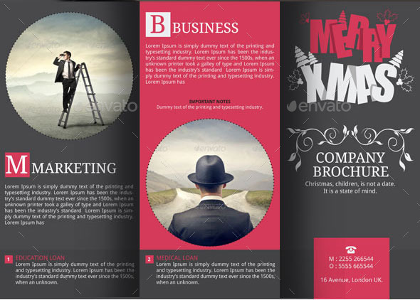
I believe that my print work meets the key conventions of
arts centre brochures as the front cover greets the readers with a big, black
and bold title and an extremely eye catching central image. The focal image is
appealing as it centres the protagonist of the film morphed with backdrop of London skyscrapers which conveys the setting of the film. Other conventions of Art-house
brochures which have been are clear colour scheme and similar use of fonts
and text throughout with logos and reoccurring symbols. A strength of my print work was I was effectively able to create
grungy effect throughout my front cover, double page spread and feature page
without looking unsophisticated or messy. However, a weakness is the usage of
landscape for my double page spread which meant I had to be very weary of my
placings of texts and images. Lastly, a plus for my print work was the chosen centralised
images which were the protagonists of my film which came out extremely aesthetically pleasing.
There was a numerous amount of unconventional and conventional aspect within our films when its comes to representation. Firstly, the two main protagonist come from two different minority groups and are even culturally diverse from each other. Although this is not something that changes the narrative, this helps change the perceptions and stereotypes that are reinforced within the film industry. In addition, this allows our audience which is mainly underclass teens from the multicultural city of London to be able to identify and relate to our character better. This is in relations to the Perkins theory which states that stereotypes have an element of truth to them therefore it is our responsible as filmmakers to represent accurately. Only 5.3% of the film production workforce, 3.4% of the film distribution workforce and 4.5% of the film exhibition workforce were from Black, Asian and minority ethnic backgrounds in 2012 which conveys why the diversity is rare on the big screen. Despite this, our group has been able to tackle a key issues within the film industry.
My online film blog page would be heavily user-generated content similar to the tag London campaign from the film 'Ill Manors' and 'share a coke' campaign by coca-cola which significantly boosted the popularity and success of these products whilst using less resources than the typical overused and tedious marketing techniques. Social Media provides great importance to films during the promotional and marketing stage as it can give a advantage to films that are heavily discussed or anticipated and also made it easier for institutions to tap in and reach their target audience. In order to reach out to the target audience, the information presented on the online blog must be appealing and relevant to our audience's wants. The audiences want to feel a sense of involvement and self complacency and the inclusion of hashtags and bloopers can do that. Social media hashtags makes it easier than ever for filmmakers including amateurs specifically target a particular demographic with similar interests. User-generated content would allow me to easily interact with my core target audience which is adolescents and allows them to voice their opinions and concerns which opens up a dialogue therefore also effortlessly increasing the popularity of my film. In addition, user generated content allows the inclusion of international viewers therefore this would strengthen the relationship between the institutions and audience. i would mention films like Se7en and Fight club which are successful films that have a similar narrative pattern and structure to ours. In addition, this would bring appeal to the enthusiasts of those films.
In conclusion to this evaluation, I believe that I have met the
targets needed for a decent brief and produced a short arthouse
film worth watching and reviewing. Also an art-house film brochure that is simple,
rich in detail and visually pleasing. This extract would provide the audiences with
a film about untold societal issues which will resonate with viewer due to its unique
narrative style and structure.
Monday 6 March 2017
PRODUCTION FEEDBACK ON 6/3/17
FEEDBACK FOR FUTURE RE-FILMING
- Sound: use extended mic
- Pan Shot: Smooth transition/ fewer shots.
- More establishing shots- both exterior and interior(variety e.g mixture of close/medium/long shot)
- Camera angle: avoid being filmed tilted wrongly
- Ensure Characters are filled in the frame evenly and correctly
- High angle shots from outside - use body language to convey whats going on internally
- Near focus to deep focus + Introduce character e.g through books and different angles/shots
Monday 6 February 2017
DONNIE DARKO REVIEW:
The story revolves around a boy called Donnie (played by Jake Gylenhaal) who is extemely witty, smart and opinionated individual but nonetheless troubled by the multiple situations he is placed in and realities that lay before him. Donnie is told by Frank, the menacing rabbit that says the world is ending in a month. Not only is that on the teenager's shoulders but the huge menacing rabbit wants him to commit all sorts of violent acts, like flooding his school and burning down a house. This is caused by Donnie's problem with sleeping walking and his astonishing survival from death early on the film therefore Donnie has a sort of allegiance and trust toward the menacing rabbit.
Despite this, Donnie still has every other aspect of a teenager's life to worry about such as romance and finding love. Lastly, an aspect of the film i thoroughly enjoyed was the ideas and concepts are significantly distinctive and ambiguous to the point that you may need to watch the film again but also thought provoking and intricate.
Thursday 2 February 2017
WEEK1
Week 1, we were able to film the Aisha hideout scenes were filmed at Northala Fields.
WWW: Usage of various of camera shots and movements e.g MS, LS, Panning shots.
EBI: There wasn't enough footage due to the rain (therefore we plan to refilm next time plan according to the weather.)
WWW: Usage of variety of camera shots (improvement from week 1) and movements. We were able to edit and use Adobe premier really well.
EBI: The sound and dialogue in the scene was not loud enough nor clear enough. This could be adjusted of the editing, so that all the scenes fit well together and there could be more different shots used.
WEEK 3
Edited library scenes by natesha with the help of me and pratisha
WWW: Usage of a multiple of camera shots and movements.
EBI: The dialogue in the scene was not as good as it could be. This could be adjusted while editing, so that all the scenes have the same volume and pitch.
(Plans for weeks to come)
Friday- Edit the scenes from Aisha hideout with the knowledge we've learnt
Saturday- Film the estate scenes at Golf-links Estate (with me, Nasteha and Pratisha)
Film the murder scene and the park scenes at Northala Fields ( with me, Nasteha and Pratisha)
Film the murder scene and the park scenes at Northala Fields ( with me, Nasteha and Pratisha)
Sunday- Film additional footage at Ealing Library (Nasteha and Me) - Try out camera shots/movements that films have used in library scenes.
Sunday 22 January 2017
Analysing of the BFI Film Festival programme front cover

First of all, the placement of the title and subheadings are nicely stacked together and the cover's placement of the title in the centre of the page rather than the top which is clearly breaking a typical convention. In addition, the title uses flesh tone colours to contrast and bring the main image behind to life. This is to bring draw attention to the leaflet for its uses of striking and evident colours. There is no sign of a slogan, offers, or heavy use of language allowing the readers to focus on the visionary aspect of the leaflet and gives the leaflet a more sleek format and look.
Brochures and Context pages analysed
This usage of rounded imaged and dotted line give a sleek and simplic overview. Also the modest colour scheme is also used to allow the reader to focus on all aspects of the brochure such as both text and image.
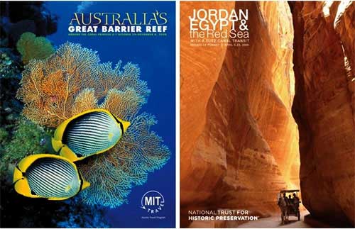
The title and subheading of this brochure is extremely informative and explanatory of the image presented. The image presented covers largely of brochure and allows the reader to focus on the context of the brochure. The focus is to visually capture the readers.

This brochure uses a colour scheme of black and green to represent and correspond with the context of the brochure which is eco friendly energy.
This brochure is unique as it allows intense use of vibrant and vivid colours to be the focal and enticing part of the brochure.

This brochure is also unique as it the design of intricate and impressive design that differs from most.

This content page uses duller colours to allow the readers to focus on the images and the design of the page which reflect the theme of cars.

This content page gives more a sleek and simplic overview as it allows the readers to focus on the medium shot of obama.

The contrasting colours between the regular colour scheme used and the red heart is used to present a more striking imagine. Another thing interesting about this brochure is the title which is broken down intro three parts and stacked on top of each other.

This brochure uses a image extracted from a film and placed in front of the title to create a perpetuate a 3D look. The colour scheme is used to create a sleek and impressive look whilst not taking away from the centre image used.
The multiple images used is to present the content and theme of the brochure and the colour scheme is to show the vivid and lambent look.
Planning and sketching
The main target audience would be particularly interested in urban and alternative films such as art house films.
The main target audience will also be in between the ages of 15-25, female and most likely still in education.
The double page spread will consist of the protagonist and antagonist side by side with alluring text relating to story of the short film. This will allow readers to be able to focus on all aspects of the double spread page. The colour scheme will be dull and ominous to allow the readers to focus on the central image.
the text used will be short and simple again to allow the image to be the focal point of the double page spread.
Photoshoot
Aisha and Noora played by Pratish and Nastesha will be on the front cover.
There will be intricately designed format and images to allure and impress the readers visually.
Two protagonist will be side by side to highlight their important and allow them to be the focal point of the magazine cover. This will be a medium shot of the characters.
Contrasting colours and expressions will be used by the two character to clearly distinguish the antagonist and protagonist.
Sunday 8 January 2017
Pre-Production
Project Schedule: (Pratisha)
Date
|
What we need to film
| |
14/01/17
|
The estate scenes
| |
15/01/17
|
Edit these clips
| |
21/01/17
|
Park scenes /Library scenes
| |
22/01/17
|
Edit these clips
| |
25/01/17
|
Aisha’s bedroom scenes
Voiceover
| |
26/01/17 – 30/01/17
|
Edit these scenes and combine all clips together
| |
Script: https://drive.google.com/open?id=0B9Oq2QuGbYq-U0t6SEJCU1o2Sm8 (Nasteha)
Shot List: (Pratisha)
Estate
Shot No
|
Shot
|
Filmed?
|
1
|
ELS of estate building
| |
2
|
LS of Salma walking down the street with her phone in her hand
| |
3
|
MCU of Salma as she looks at the estate
| |
4
|
MS of Salma as she gets a text
| |
5
|
LS of Nasteha walking out of the estate
| |
6
|
MS of Salma and Noora hugging
| |
7
|
Tracking shot of the two walking down the street
| |
8
|
Close up of Noora as she talks to Salma
| |
9
|
MS of the two, walking down the street
| |
10
|
MLS of them bumping into Aisha
| |
11
|
Tracking shot of Aisha
| |
12
|
MS of Aisha when she stops to look at her watch.
| |
13
|
Tracking shot of Aisha as she walks down the street
| |
14
|
MS of her pulling up her hood.
| |
15
|
ECU of her watch as it reads 11:10
| |
16
|
MS of her turning around and on her way to follow Noora.
|
Library
Shot No
|
Shot
|
Filmed?
|
1
|
MLS of Salma and Noora studying.
| |
2
|
OTS shot of Noora talking from Salma’s perspective
| |
3
|
OTS the of Salma talking form Noora’s perspective
| |
4
|
MS of Aisha walking down the street
| |
5
|
LS of her looking at the building
| |
6
|
Close up of her looking at her watch
| |
7
|
Extreme close up of the watch as it reads 11:20
|
Park
Shot No
|
Shot
|
Filmed?
|
1
|
MS of Salma and Noora on the swings.
| |
2
|
Close up of Noora’s feet as she kicks the rocks beneath her.
| |
3
|
MCU of Noora holding a photo in her hand
| |
4
|
ECU of photo in her hand.
| |
5
|
Close up of Noora’s face as she sighs.
| |
6
|
ECU of Noora ripping up the photo.
| |
7
|
MS of Noora walking home from the park, looking at her phone.
| |
8
|
MCU of Noora’s face as her mouth is covered by Aisha’s glove.
| |
9
|
Close up of Noora’s face as she struggles.
| |
10
|
ECU of Noora’s widened eyes
| |
11
|
Close up of Noora’s phone on the floor as it rings.
| |
12
|
MCU of Noora’s dead body as she lies on the ground.
| |
13
|
MS of Aisha as she stands over Noora’s body
| |
14
|
MS of Aisha looking around and walking away
| |
15
|
MLS of Aisha waiting by the gates of the park.
| |
16
|
MS of her turning around to look at Noora and Salma
| |
17
|
ELS of Noora and Salma
| |
18
|
OTS shot of Aisha looking at them.
| |
19
|
Tracking shot of Aisha as she walks past the park
| |
20
|
OTS shot of her looking at the photo.
|
Aisha's Bedroom
Shot No
|
Shot
|
Filmed?
|
1
|
MS of Aisha looking out the window
| |
2
|
Close up of Aisha looking out the window
| |
3
|
Close up of Aisha sitting down and writing a note.
| |
4
|
ECU of the writing on the note.
| |
5
|
Close up of Aisha sitting down and writing a note.
| |
6
|
Close up of her looking at her schoolbooks
| |
7
|
MCU of her throwing the books on the floor.
| |
8
|
OTS shot of her looking at her trophies
| |
9
|
Close up of Aisha as she stops writing.
| |
10
|
MS of her as she puts on her jacket
| |
11
|
MS of her looking out the window.
| |
12
|
Close up of the writing on the wall
| |
13
|
Zoom out to reveal the plan to kill Noora
| |
14
|
Extreme close up of Noora’s picture on the wall circled in red.
|


Subscribe to:
Posts (Atom)